Horizontal vs Vertical Pages
I just started drawing in a Stillman & Birn sketchbook, which is in landscape orientation. The one I used before this was a vertical format Moleskine sketchbook. I like to change page formats when I move from one sketchbook to another. I look forward to making the change, even when I’m moving to a page format I’m not very comfortable with.
In this post, I want to share some reasons for why I like to change things up, and some observations from the latest switch in style, effort, and framing.
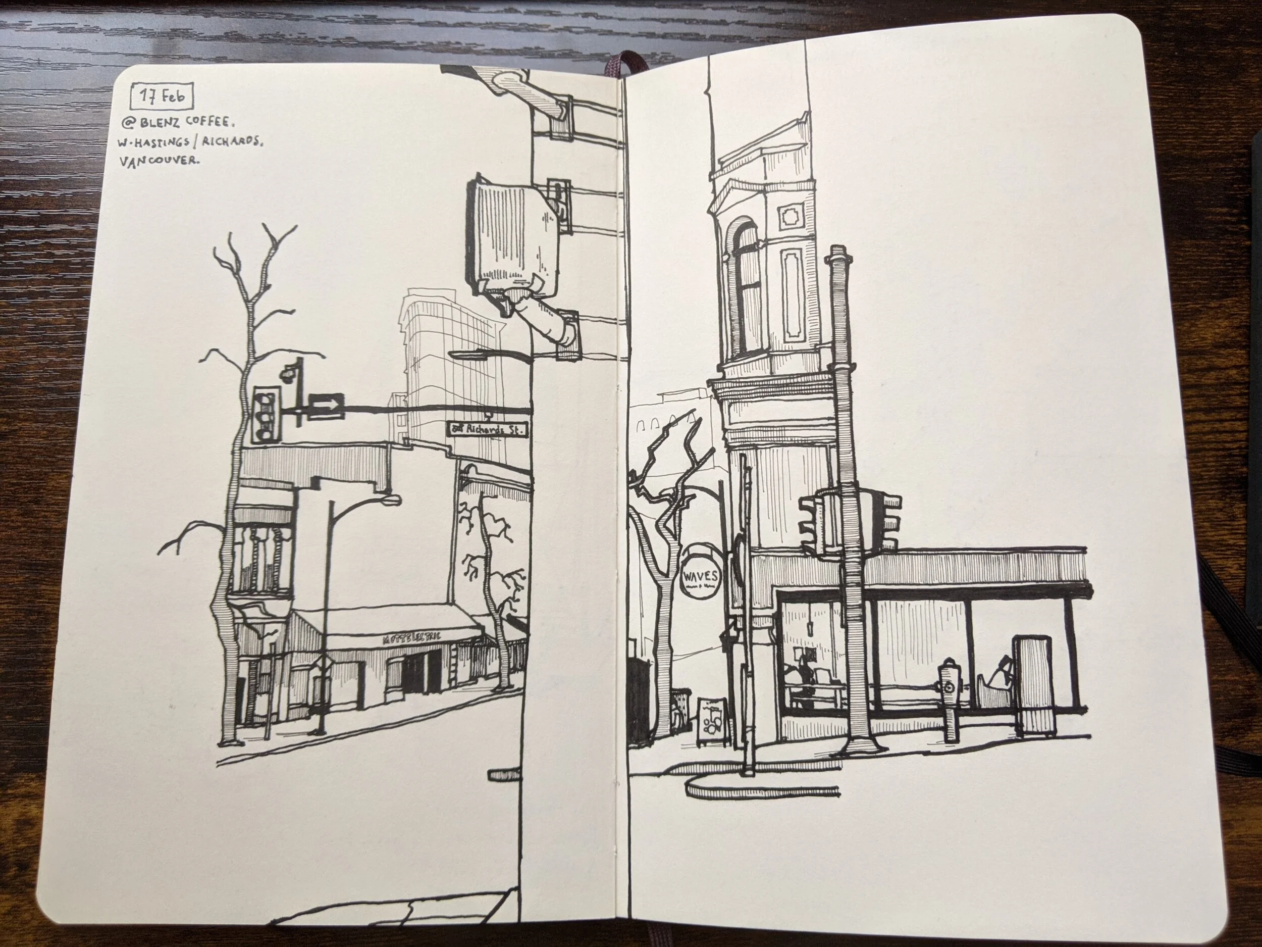
Vertical format (Moleskine, left) and horizontal format (Stillman & Birn, right)
Why make the change?
It’s a good question. Isn’t it important in the artistic journey to find the style, size, paper, and supplies we most like to use? Isn’t comfort level essential to make better art?
For example, I know that I have a preference. I like to use vertical orientation sketchbooks of the size that I can hold comfortably with one hand. It works best for me when I draw outdoors, and I am naturally suited to seeing and framing subjects in that orientation.
I make the change, not very often but often enough, to challenge my natural processes. The sketchbook you use affects the subjects you see, consider, and narrow down. When drawing on location, how you regard an interesting subject depends on where you will draw them. You try to frame the subject, human or not, in an attractive way. You consider the composition of the scene - where other elements sit, what they say, how they match with the primary subject. There are relationships to consider here. Are they bigger than the subject? Are they much smaller? What does that mean? Who is in whose shadow? What does a person mean, suspended alone in ether, and what do they mean when under a tall traffic light? Things have value in comparison and contrast with other things.
These are the assumptions that get challenged when I change the ‘frame’. I don’t think of it as a sketchbook, I think of it as a frame. Inside this frame, wide or tall, my universe will be built. When I put a person in it, for example, what do I want to say about them? Do I want to suggest how small they are in the big city? If so, do I want a tall building behind them? Can’t do that so easily in a horizontal format sketchbook. Do I want to suggest they are just one in a big crowd? May be that is better suited to a horizontal frame?
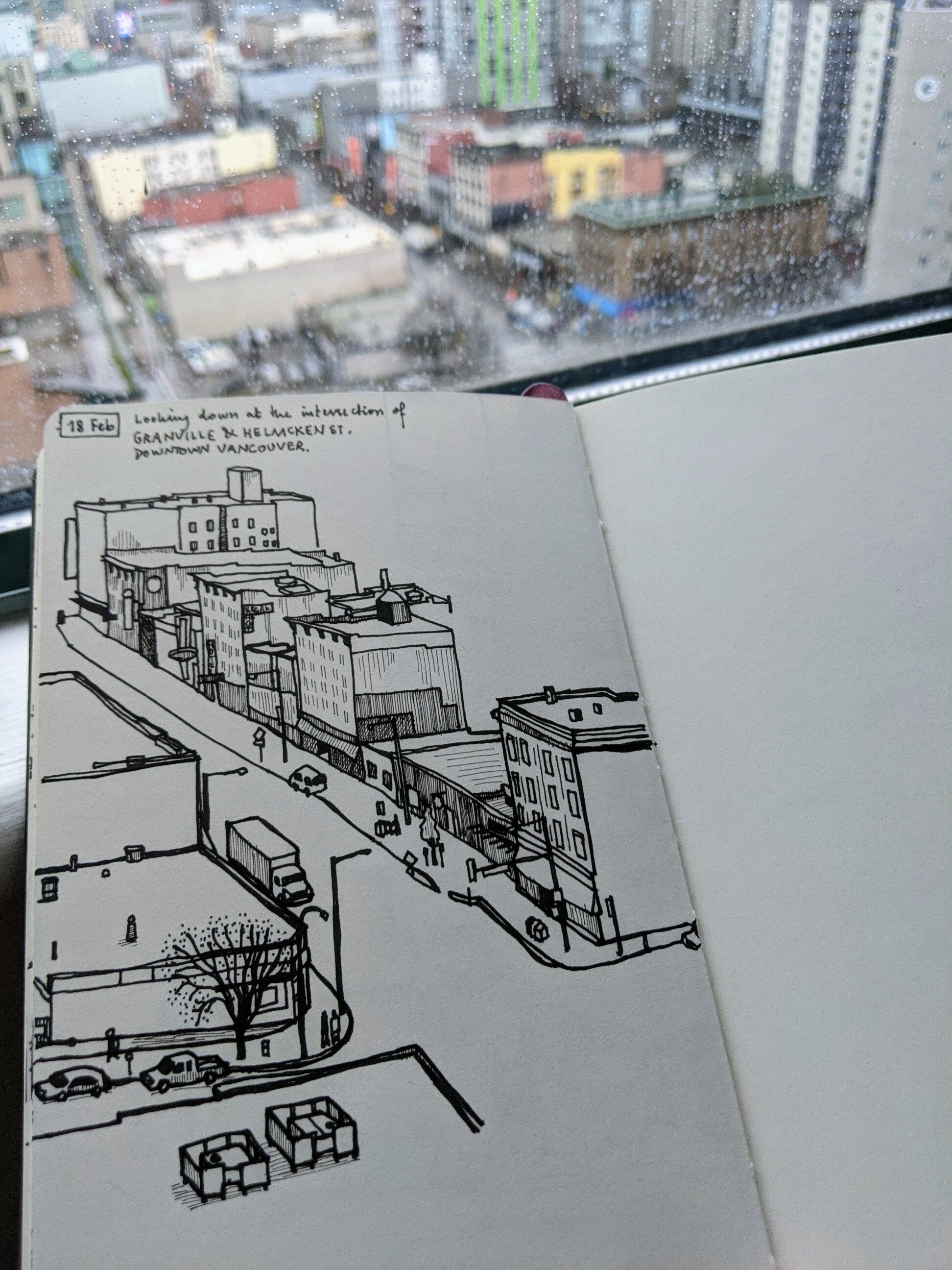
How a spread looks in the Moleskine - note foreground, middleground and background
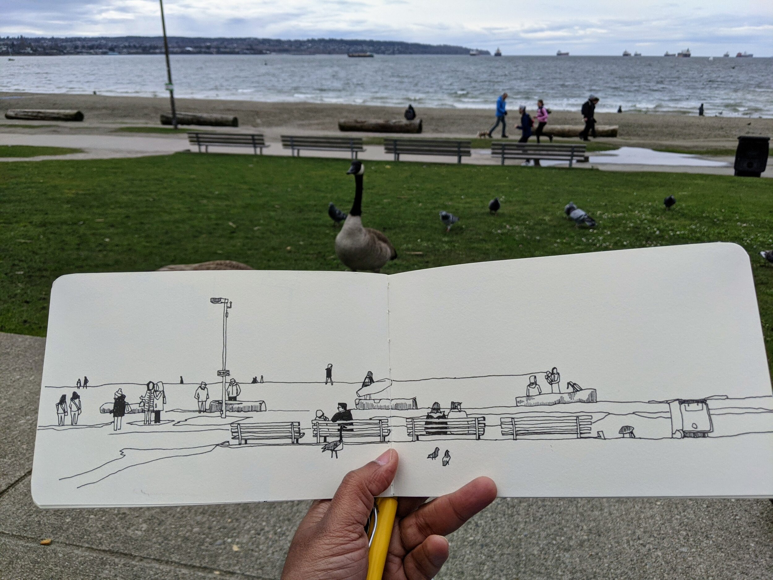
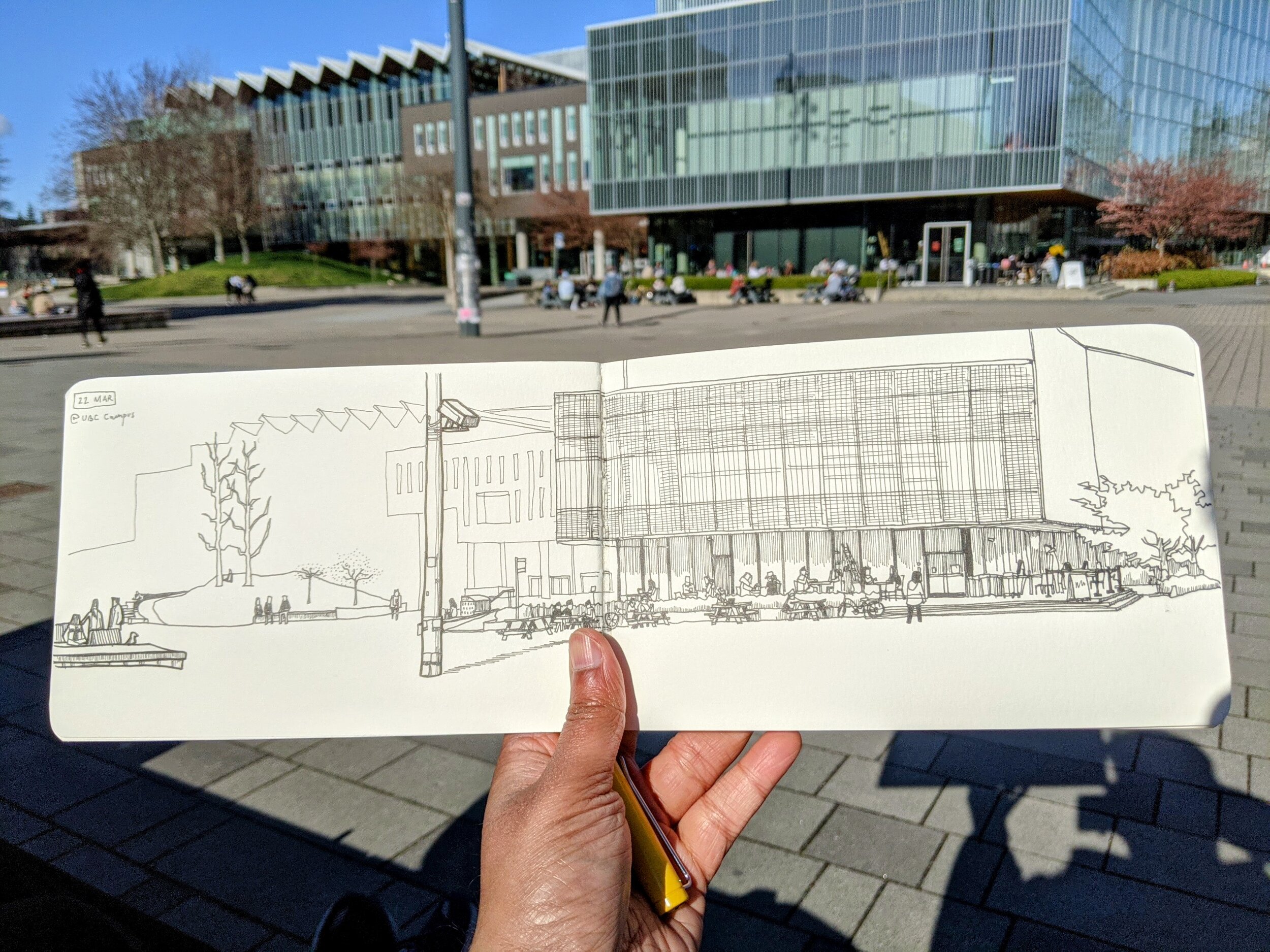
Spread in the Stillman & Birn - things fade in importance at the edges than front to back
Changing the frame, then, is a new way to see the same old thing. It’s a new way to show the same old thing. I am excited to even re-draw the scenes I have already made in the vertical sketchbook, because now the same subjects will be framed another way, casting focus on another aspect of their appearance. This exploration is as important to me as looking for new things to draw.
The New Normal
I moved from a Moleskine sketchbook to a Stillman & Birn sketchbook. It is horizontal format, and the double page spread is magnificently long. With this book in hand, I instinctively sought a scene that spread out before me in the same way.
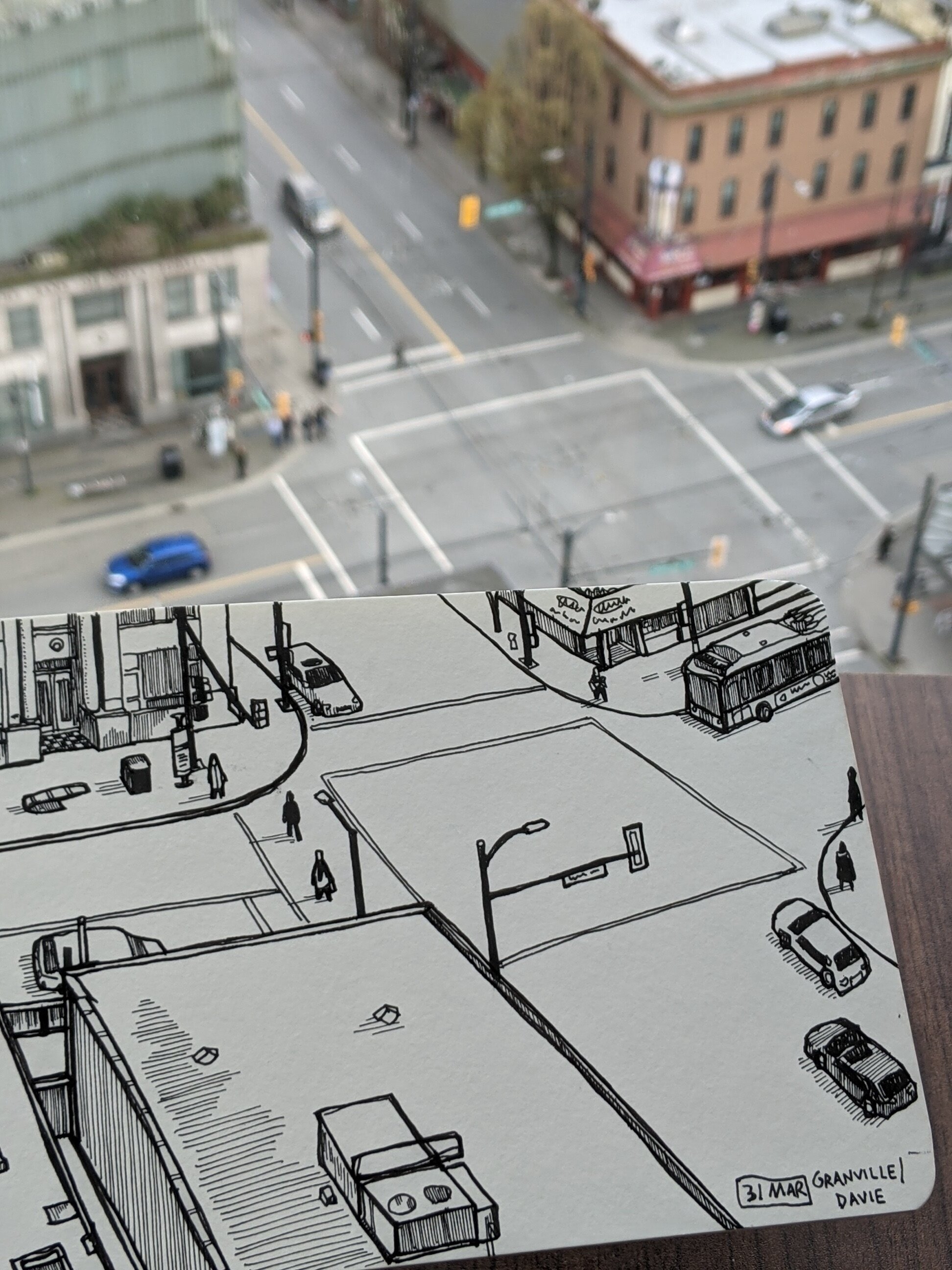
But today, I drew a different scene in only one page, and it challenged me in a way that none of the above did!
This was a view out of my window, facing the SSE direction. It was the street intersection of Davie and Granville in downtown Vancouver. It’s a busy area with lots of foot-traffic, buses and cars. But that wasn’t the real challenge. The real challenge was in the buildings, unmoving, unadorned. The real challenge was the shift of perspective from left to right.
I never noticed this shift before, because I drew in the Moleskine sketchbook. The vertical format doesn’t have enough room for perspective to change very significantly. But in the horizontal page, a lot of elements had to obey a shifting perspective line, and a lot of them had to line up against other elements. That kind of rule obedience kills me. I know that small mistakes will stand out. I like to draw without too much over-thinking. And I always need to think about perspective.
So that had me thinking about how I prefer the vertical sketchbooks when doing this sort of thing. And I thought about how other artists surely also find these preferences and discomforts, and pick sketchbooks according to their areas of expertise as much as their areas of weakness, or irritability.
What are your thoughts? Do you have a sketchbook preference? What are the reasons for your preference? Aside from paper quality and overall size, do you have a format preference? How does that work?
And, lastly, do you also like to change things up?

